Eros Dating App - UX/UI & Motion Design
This is a dating app I designed. Of course there is a proliferation of dating apps on the market and the world probably doesn't need any more. I created this to learn more about user interface design and the user experience design process. I also created this to get a more in depth knowledge of how I can use software I'm already very familiar with, within the context of UI/UX design.
Industry: UX / UI
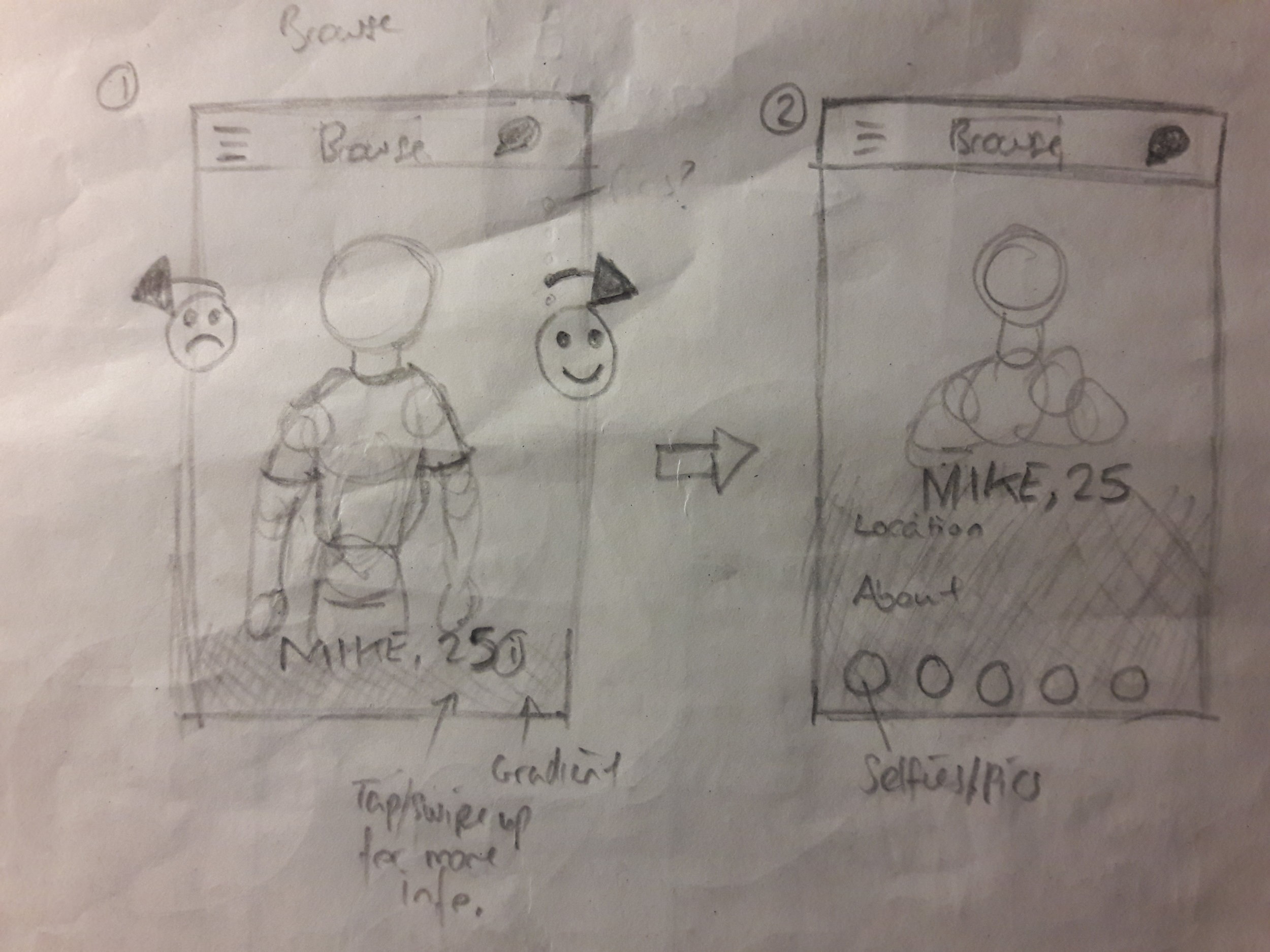
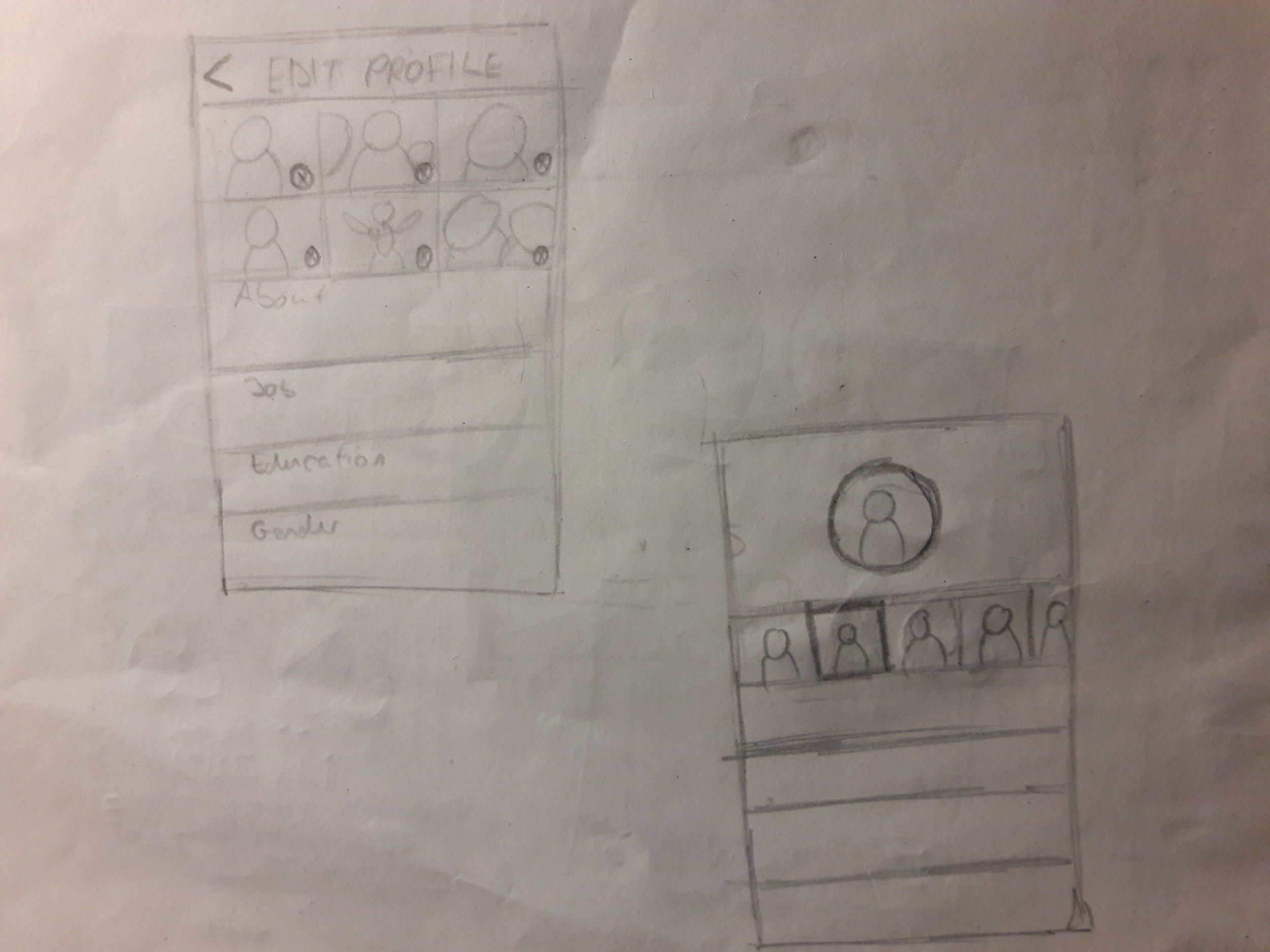
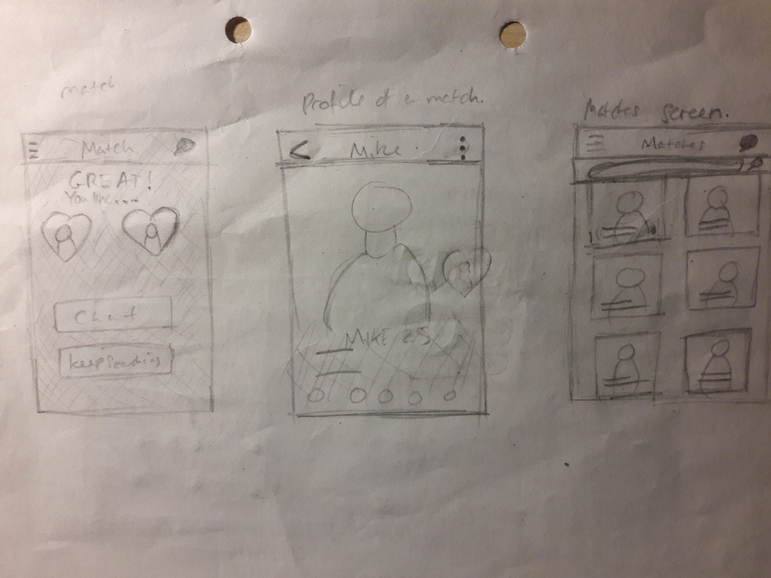
Sketches
I sketched out some of the screens to think about the various forms the app could take. This helped me alot when it came down to the wireframing and visual design of the app. At this stage I like to be free and just get ideas out of my head and onto the paper.
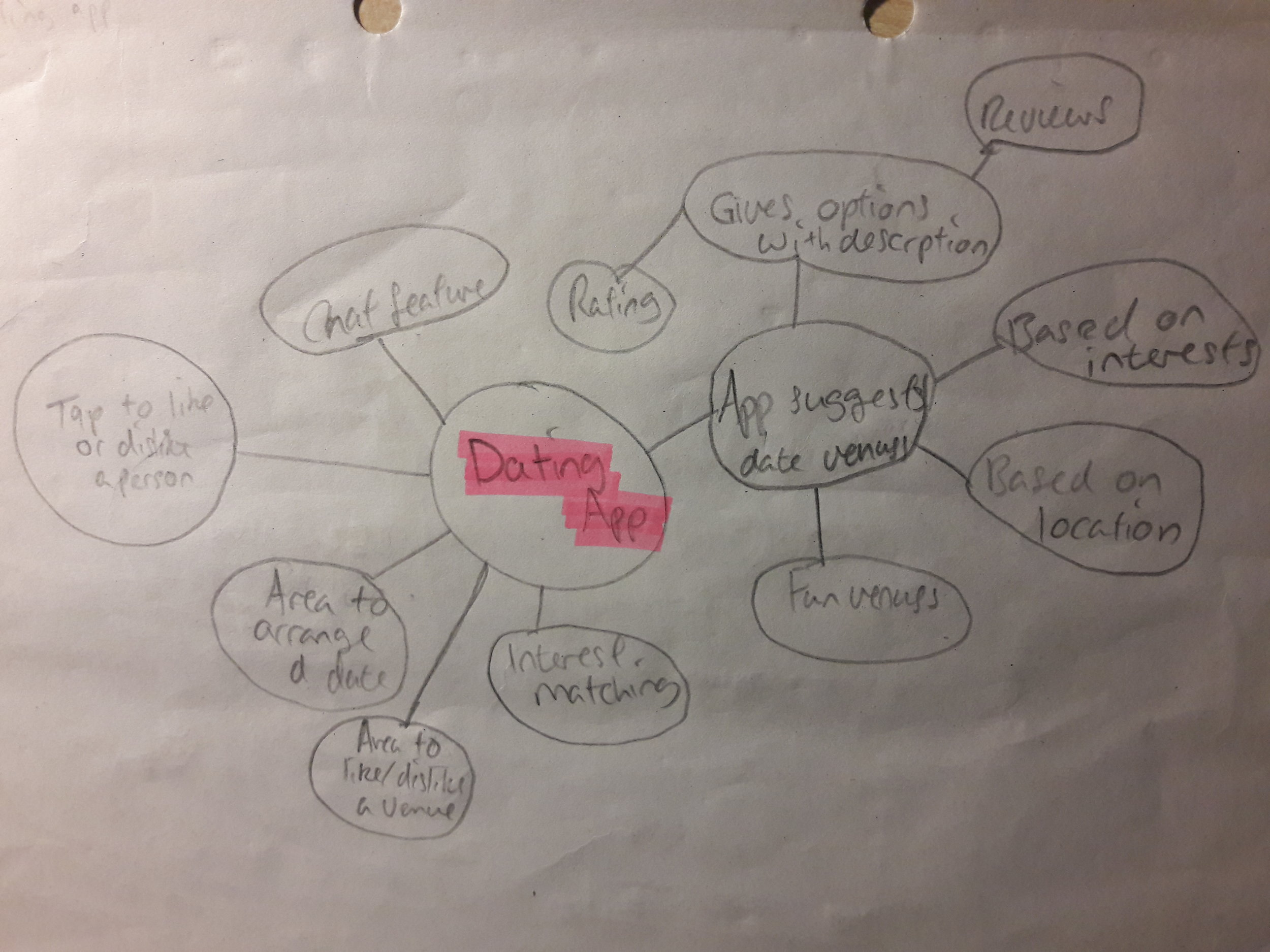
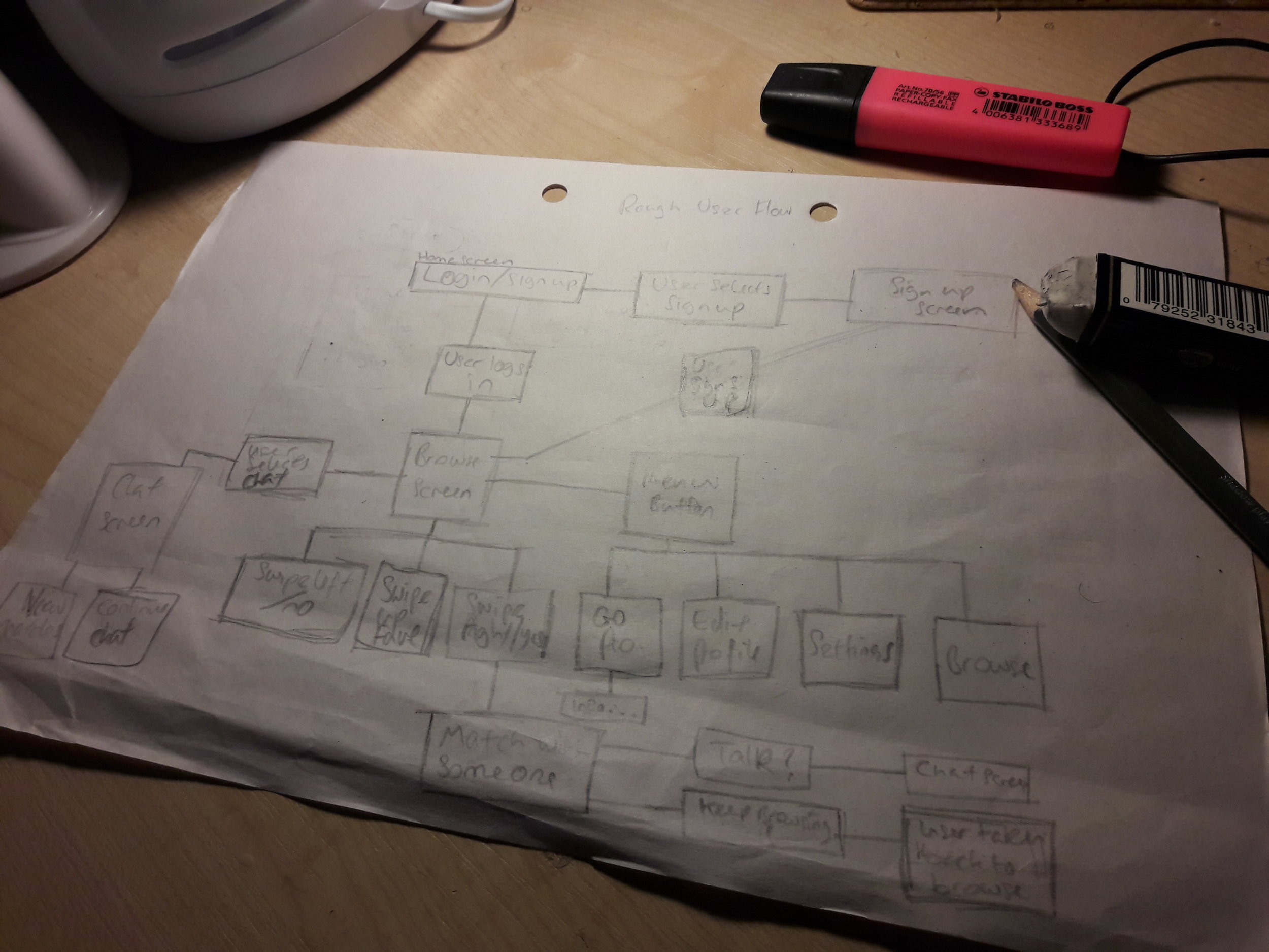
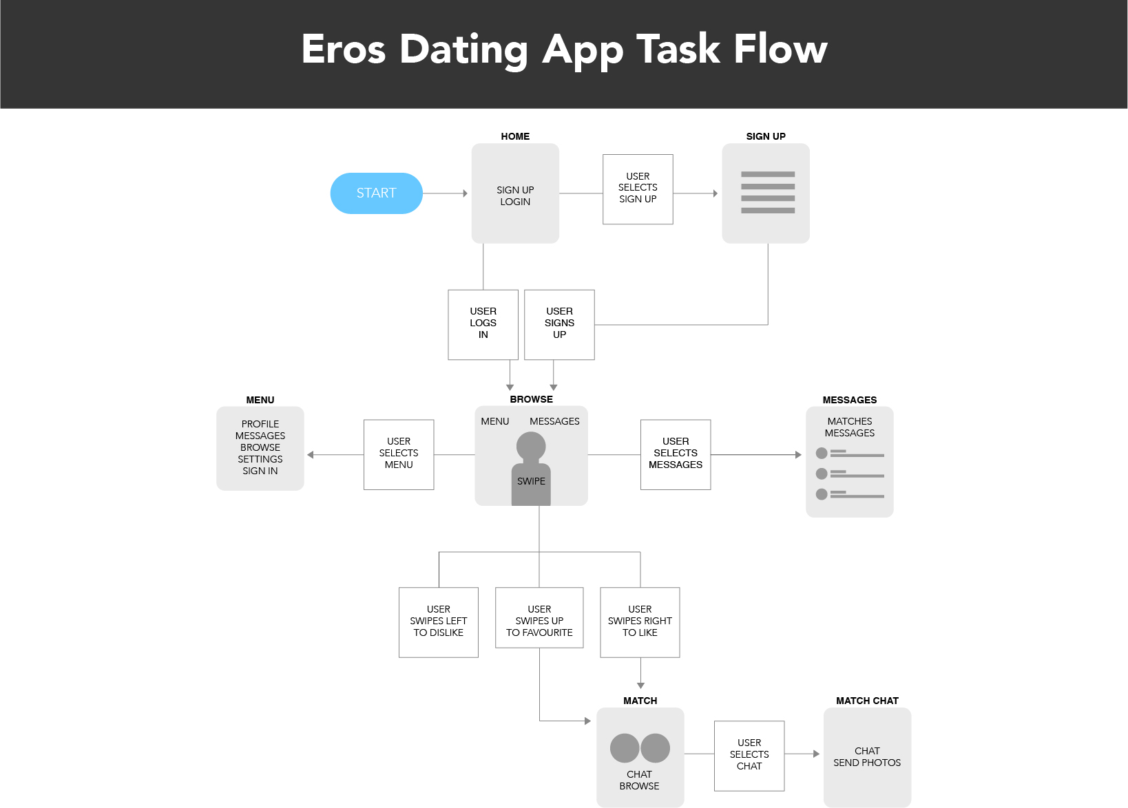
Rough Low-fidelity Task Flow
This is my rough User Task Flow. I created this to help me understand how the experience will unfold over time. Sketching this out also gave me a more clear idea of what pages I will need throughout the app. This highlights the various tasks a user will do throughout the app.
Detailed User Flow
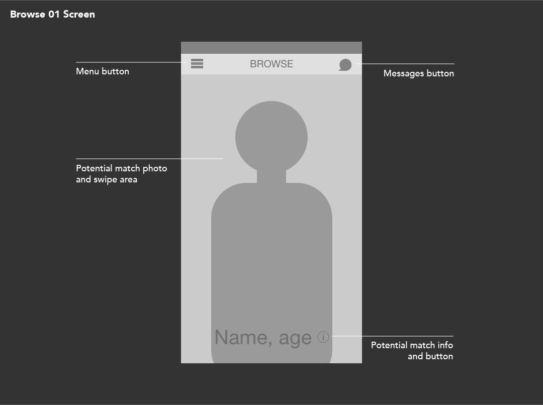
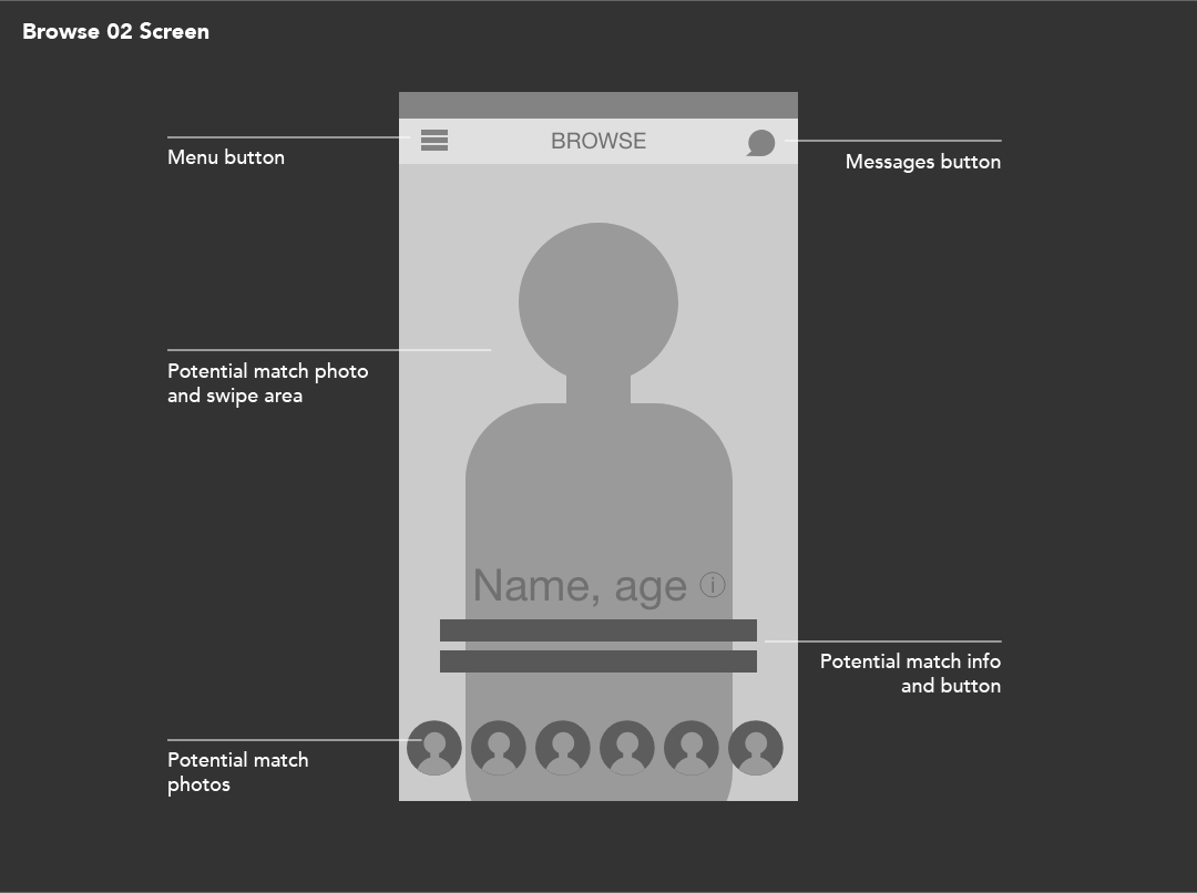
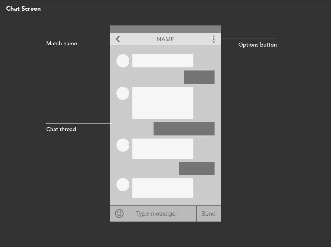
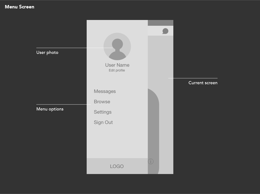
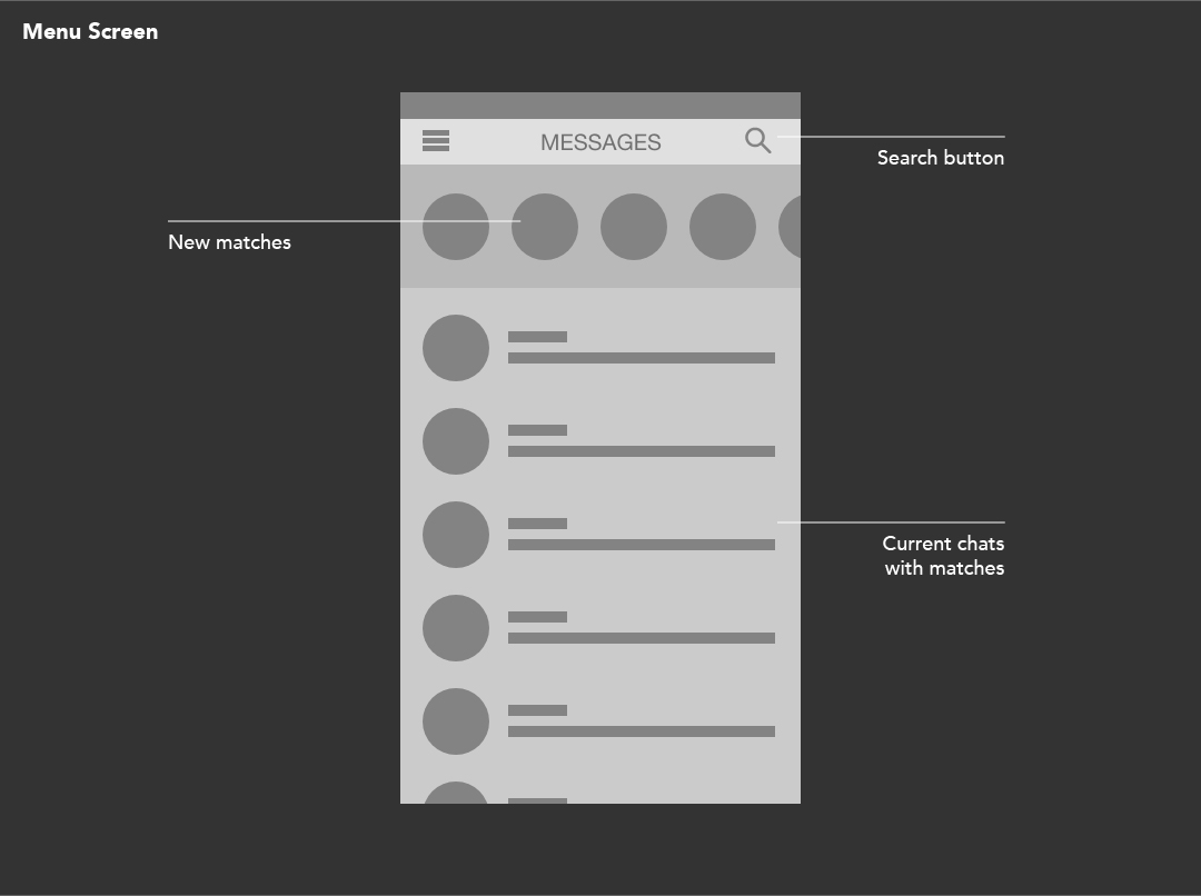
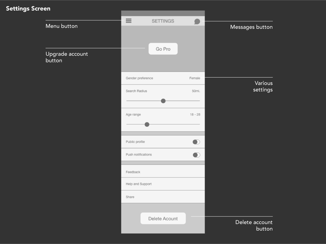
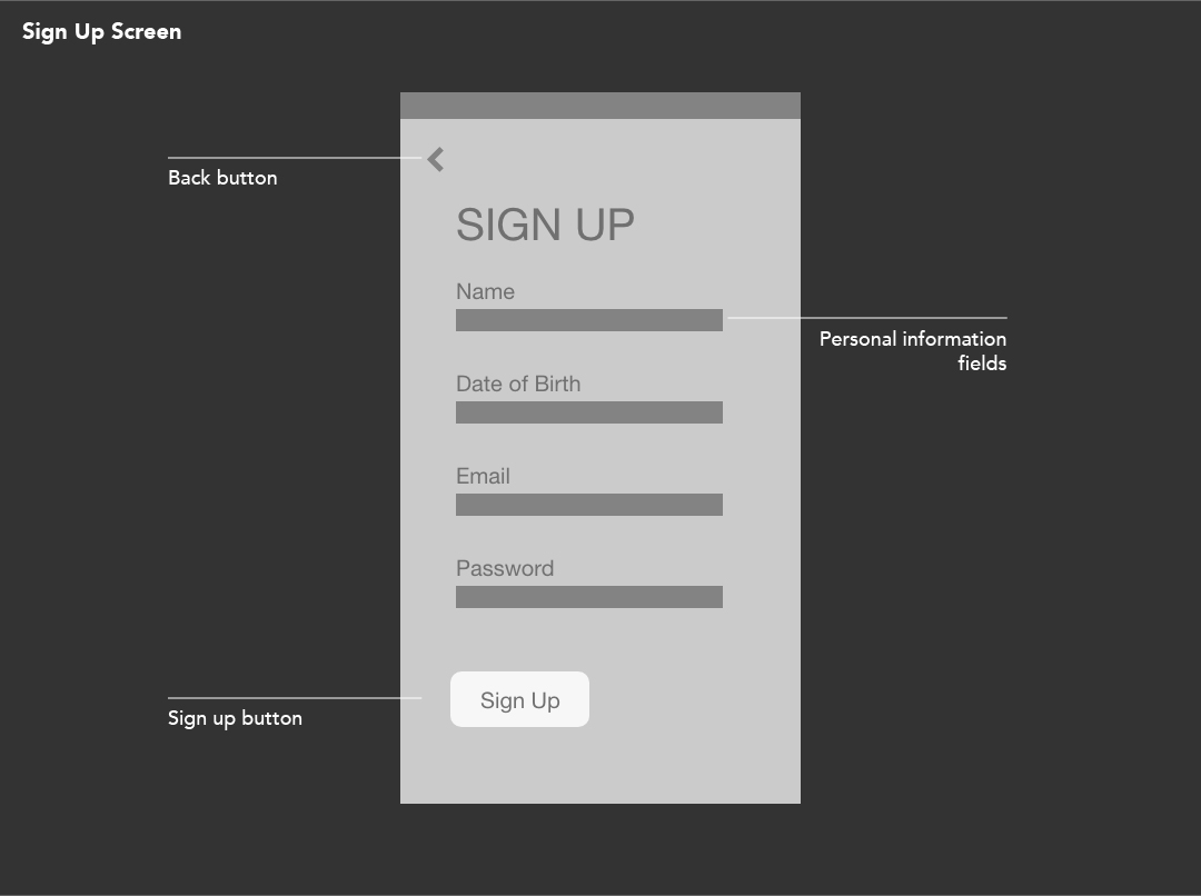
Wireframes and Low Fidelity Interactive Prototype
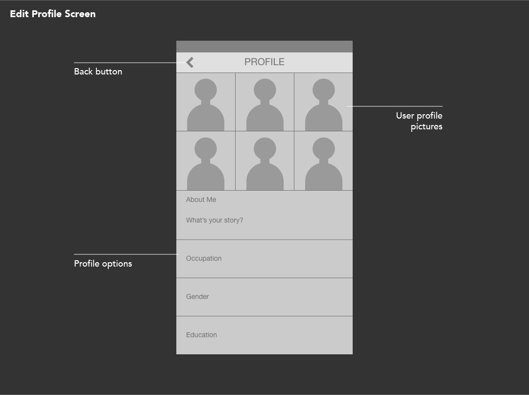
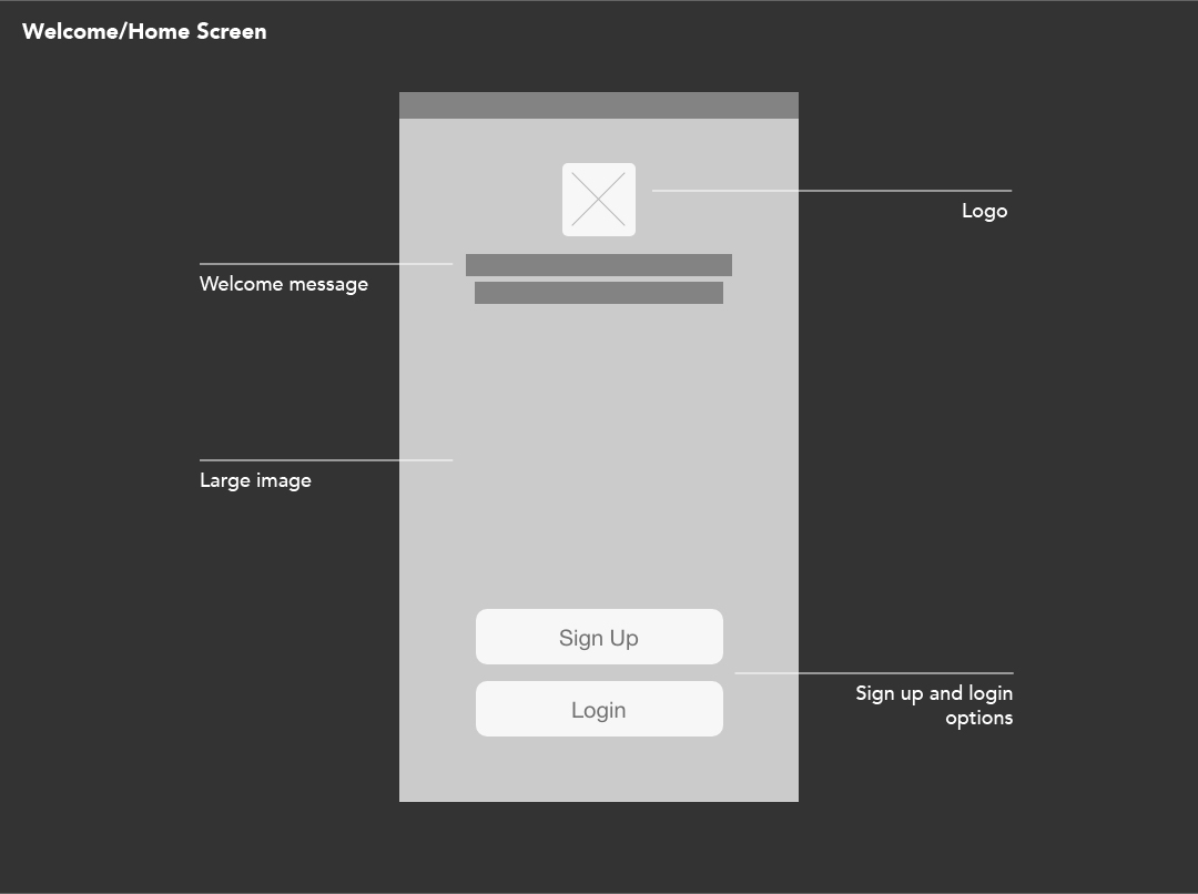
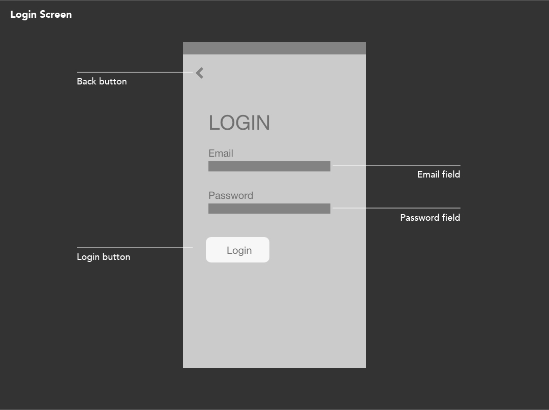
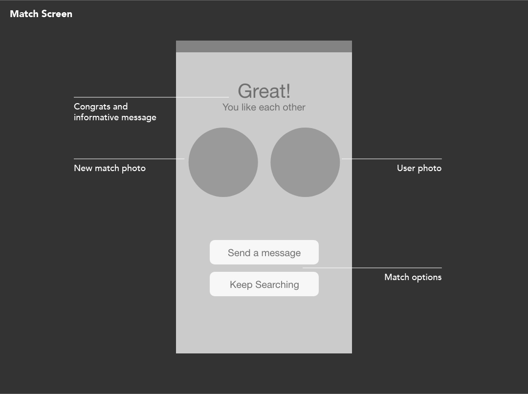
I created these wireframes so that I could know how the app would look and function in detail. The wireframes helped me to focus on the basics like, what is the information that should appear on the screen? How should it be laid out? And what navigation is available to help someone move from one part of the app to another? I created these wireframes with the UX/UI design tool, Adobe XD. This is a great tool that allowed me to create my wireframes very quickly.
Beside the wireframes is an interactive prototype I created with the wireframes. Once again I used Adobe XD to create this motion design video, this time using the prototyping/motion design tools within Adobe XD.
Colours
These are the colours I used for the app. Red is the main colour and features the most. I chose the colour red because the name of the app is called Eros. The word Eros is one of the four ancient Greco-Christian terms which can be rendered into English as "love". Eros refers specifically to "passionate love" or romantic love. Red is a particularly powerful colour and is often associated with passion, love, power and desire.

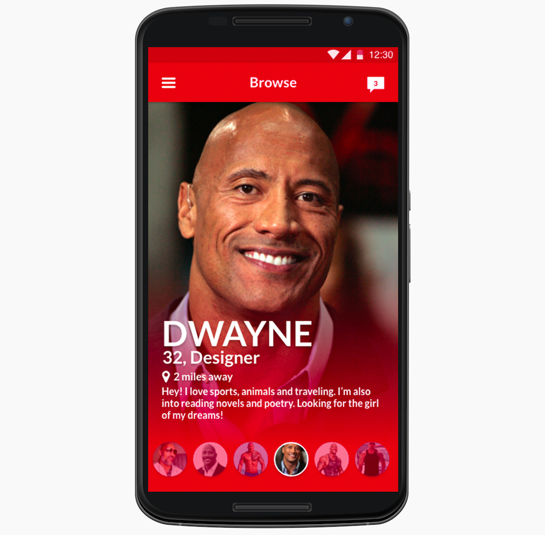
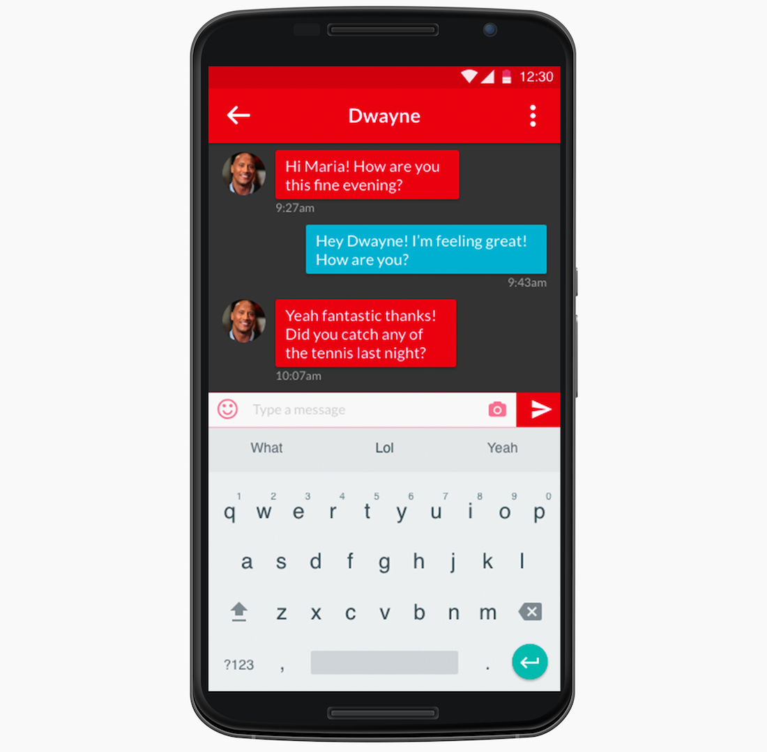
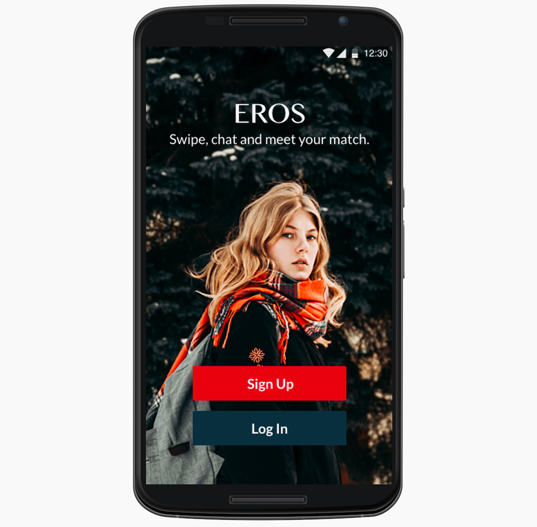
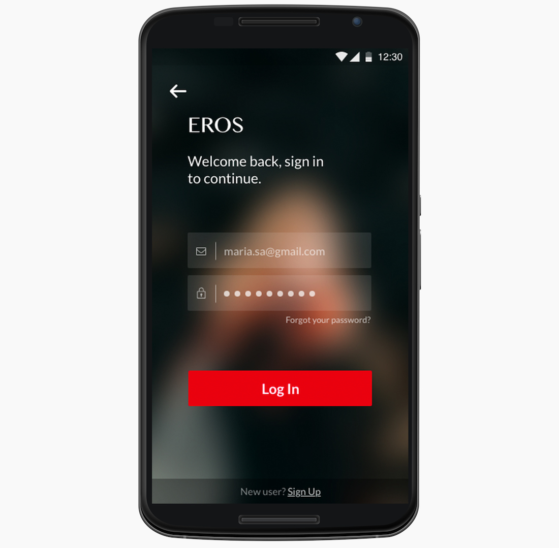
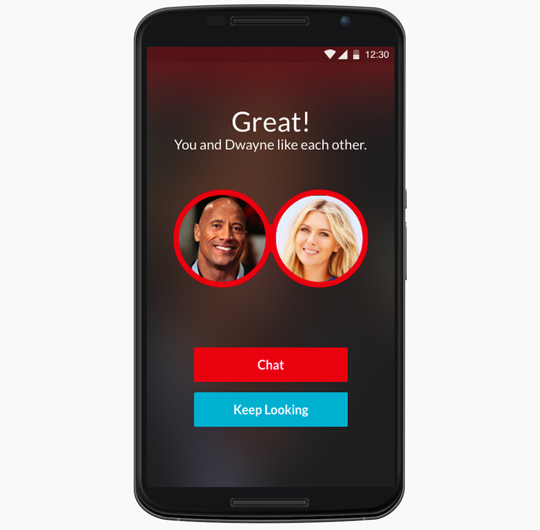
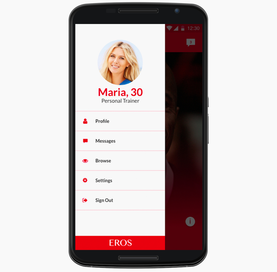
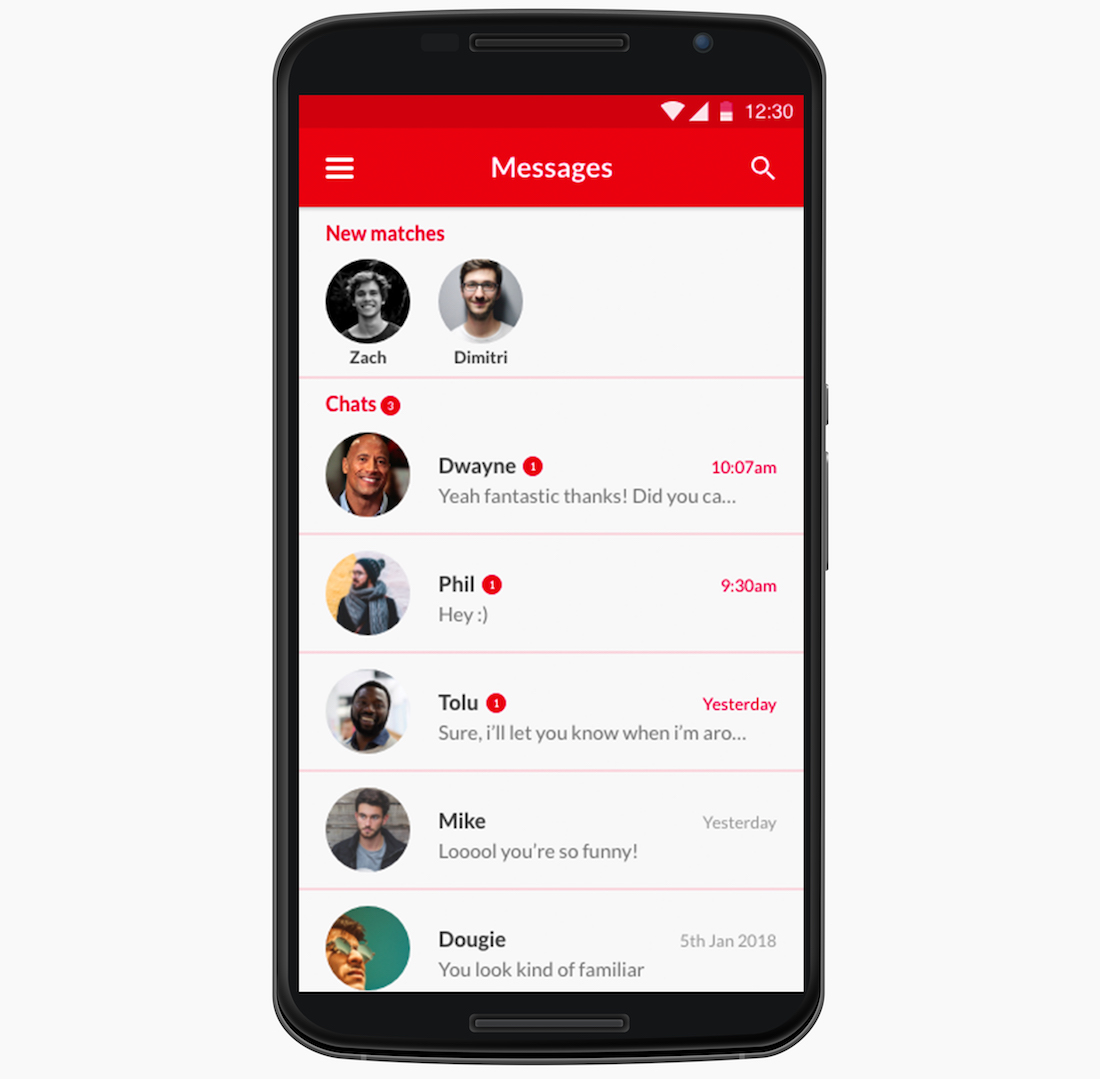
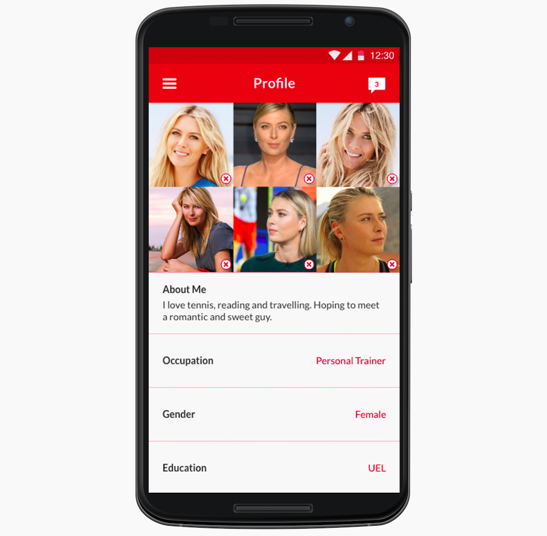
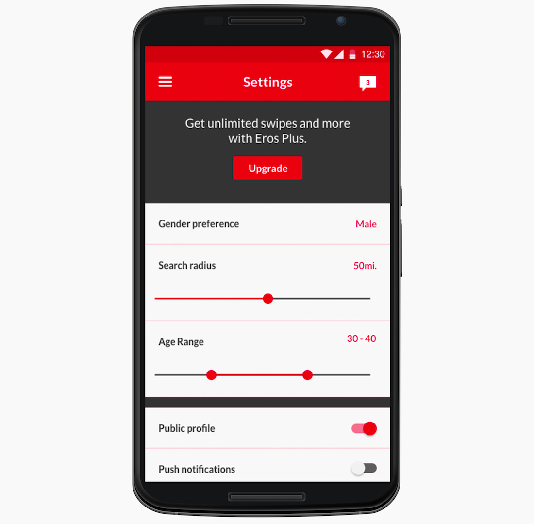
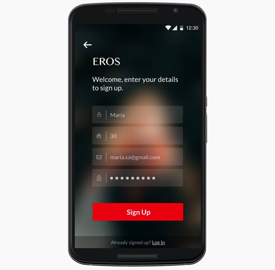
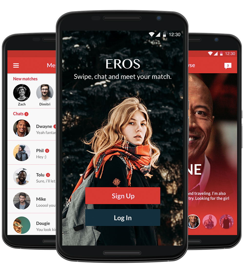
Visual UI Design/Mockups
Here is the final app design.